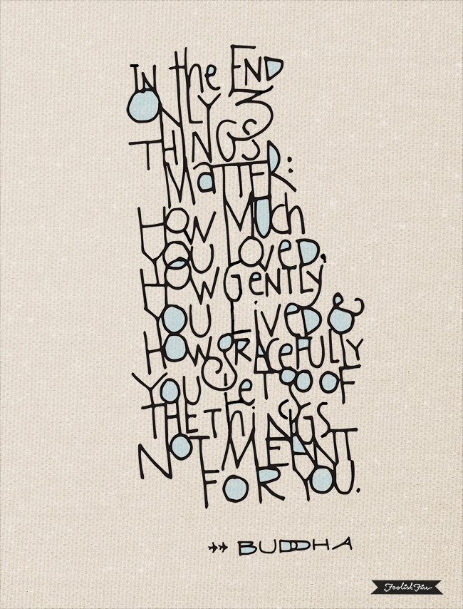
From the last few posts I guess it’s obvious that I’ve been playing around with a more free-form, lattice-type, scaffold kinda thing. What’s different about this piece is that after I scanned the inked page I brought it into Illustrator and did an image trace. All the little awkward joints and intersections got smoother as if it melted together a little. Then it was just about doing some clean-up in Photoshop, adding a subtle background texture and voila. I tried a bamboo pen and black ink on watercolor paper for a first run at it but opted for a .8mm technical pen, doing the original at a smaller size than and then slightly enlarging the placed image in Illustrator before image tracing it.
I’ll probably leave this style for a while and return to more structured lettering projects, but I do gravitate toward a more spontaneous, quick execution sometimes. Especially after doing more serious, wrist wrenching calligraphy or a complex chalkboard.
And I love this quote. The Buddha gets right to the heart of the matter, yeah?