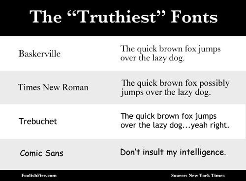
Here’s a factoid for my fellow typography geeks. Inspired by the account of a college student who could allegedly raise his grade by using serif fonts over sans serif fonts, New York Times columnist Errol Morris conducted his own experiment using his readers as guinea pigs. The story is here and I won’t give away the conclusion, but suffice to say, if you want to establish cred among your readers, use a font that starts with B and rhymes with “askerville”. You’ll note that a lot of my recent hand lettering references this font. Next experiment: which fonts get the most repins!!