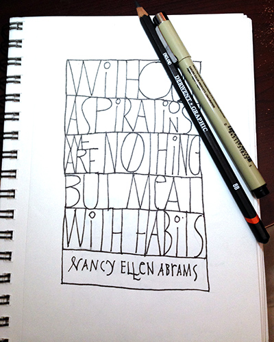
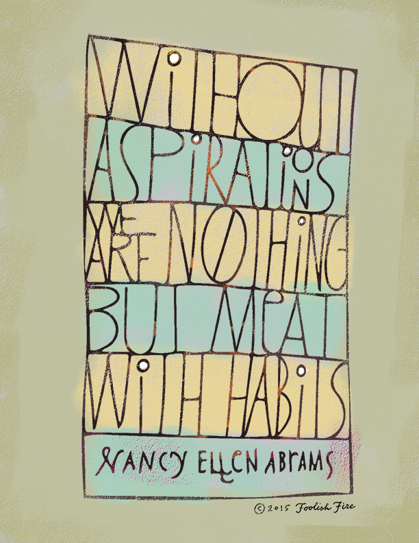
I read this quote in a recent article by scientist/philosopher Nancy Ellen Abrams on the NPR website and let out a “bwaaa-hah” that sent my cat into the next room. Love the pull-no-punches ideas from this author and this quote from her is both inspiring and a little sobering.
And because I can’t help from spilling my guts about new hand-lettering techniques, here’s the deal with this one:
I sketched this in  pencil first, then inked it in with a .5mm Micron drawing pen, then erased the pencil. Then came the magic part. I opened an app called Adobe Shape on my iPad Mini and without even so much as moving from my desk, created a vector image of the sketch, which then was automagically uploaded to my Adobe Creative Cloud library, which then I accessed from the Photoshop CC Library panel. So cool. You can also store color swatches, graphic assets, styles and all sorts of other stuff in the Library and access them from Photoshop, Illustrator or InDesign. And the experimentation with Shape has only begun. The other night I was watching TV and tried photographing a few images of the screen with Shape. Suffice to say if you pick your moments…
The vector image from Shape created some odd interpretations in certain places so I created a layer mask over the whole text layer after sliding the artwork from the Library to an 8.5×11, 300 dpi background file I created in Photoshop. The mask allowed me to edit the layer without making permanent changes.
Then, to get some of the pastel effects, I placed the layered .psd into a Corel Painter file and with the text artwork layer selected, chose Select > Auto Select, which gave me a selection of the artwork. I hid the text layer, created a new one and started working on the text with a pastel brush. The backgrounds, counter fills, were also done with a pastel brush on separate layers. I saved the Painter file as .psd and opened it in Photoshop to generate the web images, etc.
The Shape of things to come
All this took about an hour. Of course to replicate this workflow exactly requires having a Creative Cloud account with Adobe, which I do for my day job anyway. But even without the instant gratification which the Adobe CC Library makes possible, scanning your inked artwork and “vectorizing” it makes for some intriguing results. There are services like Vector Magic that will do an online scan on a per piece basis, if you’re curious. They also sell a desktop version of their app but it’s crazy expensive. Anyway, these tools (Shape + Photoshop + Painter) really work nicely together with my particular lettering style which is more free form and primitive. But I know serious big time letterers like Jessica Hische work in a similar style—sketch, ink, photograph, vectorize, refine. In her case, refine refine refine refine. Not so much with me.
