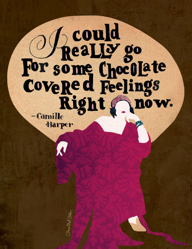
My new friend Camille Harper routinely says stuff that can keep a hand letterer busy for days. So when I read this Facebook post she made a while back I immediately asked permission to commit it to paper, then pixels.
My wife told me it’s now her “PMS poster.” I am hereby smiling and nodding.
The process: thanks Norma Talmadge
I immediately found inspiration in my vintage photo collection in the form of a beautiful old portrait of the silent film star Norma Talmadge. The huge throne-like chair she was posing in became a perfect backdrop for the quote, which I did last. First though, I created and 8.5×11, 300 dpi RGB file as the base file for the piece.
As with most of the quotes I’m doing these days, I like the free-form, bold styles of the classic serif fonts—in this case Clarendon Bold. Obviously I take liberties with almost every rule of typography but then that’s what makes hand-lettering so appealing, to me anyway.
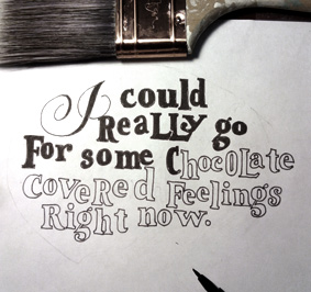
Once the text was inked in it was scanned at 300 dpi and then placed into the same sized Illustrator file. I then did a Live Trace at a high level of detail and expanded the trace to create vectors. After releasing the compound paths and expanding and ungrouping until I could select each letter individually, I copied and pasted the entire text into a layer in the base Photoshop file.
*Alternatively, you could just cut and paste your scan directly into the Photoshop file and bypass Illustrator, but I’ve come to like the way the Illustrator live trace includes the “counters”, or spaces inside letters like “o” and “e” and “p”, so it’s easy to make those a different color if I want to. It also tends to pick up all the little flaws and lack of precision in the inking process I intentionally include, which give it a more organic look and feel.
The main background art also started out in Illustrator with a placed file. I drew the vector shapes needed to convey the form and pasted them by group into individual layers in the Photoshop file. So skin tones as one layer, the dress as one layer, etc. Each shape layer was then selected (Option-Click the layer preview), and then did a “Edit > Paste Into” of the various textures, some with blending modes added allowing the original solid color beneath to influence the final look.
So to review, here are the steps (and these are pretty much consistent for all pieces like this):
- Find a great quote or write one
- Do preliminary sketching to establish a layout
- Locate any source material to reference for shapes and textures
- Pencil and then ink the letter forms
- Create the base file artwork in Photoshop by creating layers and filling with textures or colors
- Scan and place the lettering file in Illustrator
- Make a “live trace” and expand
- Delete bounding box background
- Play with releasing compound paths and ungrouping until individual letterforms can be selected and filled
- Cut and paste vectorized letterforms into the base PSD file
- Tweak the final layers to achieve the right look, color palette, etc.
The final product is always a hit and miss thing, especially arriving at a final color palette. Doing most of the artwork digitally almost gives you too many choices, so editing is important and having a solid idea of what you want. It can take a few minutes or a few days. This one came together in a few hours, thanks to a little art direction to get the colors right.